HAYDN AI
Project At A Glance
The Ask:
For this project with Flatiron School, I inherited a style guide from HAYDN AI, an AI content generator. With those provided materials, I was tasked with:
determining and validating the information architecture for HAYDN AI’s marketing website
designing a marketing landing page that would be responsive across mobile, tablet, and desktop views
building hi-fi prototype screens for HAYDN AI’s digital product
I conducted research and followed a process of ideation and iteration to present designs that reflected HAYDN AI's desire to be friendly and approachable. I centered accessibility and user ease-of-use in my designs, as HAYDN AI is “a writing assistant for the rest of us.”
Team:
This was a solo project. I often reached out to my colleagues and instructor for peer critique.
Timeline:
3 weeks / Nov - Dec 2022
My Contributions:
UX Designer: information architecture, competitive analysis, user testing, synthesis
UI Designer: mid-fi and hi-fi prototyping
Interaction Designer: microinteraction design, animation
Product Designer: presenting to stakeholders
The Discovery Phase
The Competitive Landscape:
Before launching into the information architecture and designs, I wanted to see how other AI content generators structured their marketing sites and attracted users. I conducted a competitive analysis of the information architecture and visual design of 6 competitors:
Many of the competitors had landing pages that were visually busy, and I knew that HAYDN AI wanted to pitch itself as a brand that helps facilitate user work. Thus, it was important to create a calming and uncluttered landing page to evoke that sense of organization and trustworthiness.
Competitors repeated the same call-to-action many times (and often this was the main/only CTA)
Competitors had large and bold hero images to capture user attention, notably on the desktop page
Competitors had limited information on their landing page, often without details regarding pricing
Our User and Their Mental Models:
Based on the provided style guide, I knew that our target users were content creators of all kinds, from social media influencers to larger businesses. After drafting a site map, I needed to validate my information architecture to ensure it aligned with user mental models, thus lessening the cognitive load and allowing users to engage with the product. I conducted an open card sort to see how users would categorize and label information. I opted for an open card sort because there were several categories that I felt unsure of (particularly support resources for HAYDN users).
I conducted this open card sort with 3 different users, all of whom were content creators. Throughout the activity, users thought aloud to narrate their thoughts, reasoning, and questions. I used the OptimalWorkshop analytics to help analyze insights about which cards appeared together most often and how users categorized information. This open card sort brought about several key insights:

Some groups were obvious to users, such as information relating to log-in and contact us.
Users found the word “plan” confusing and did not initially realize that it stood for pricing options.
Because the users were not provided with preexisting category labels, they sometimes mixed together items that I had drafted into separate categories relating to what HAYDN is, why use it, and resources for users.
Finding The Solution
Finalizing The Site Map
Ultimately, the open card sort validated my decisions and allowed me to implement the information architecture with confidence because I knew it matched the mental models of the target user. I was able to finalize the site map:
Visual Design Iteration
Per the project brief, my UI had to fit within the preexisting style guide for HAYDN AI, which emphasized the importance of:
Images of real life people to convey diverse representation and warmth
Written tone equivalent to a beach formal dress code - relaxed and polished
Brand representation that was friendly and approachable, while remaining respectable
These instructions in the style guide informed how I designed my mid-fidelity wireframes:
The marketing copy that I used had a conversational tone to engage the user, keeping it human while also respectable.
Imagery contained real people, from the hero image to my incorporation of video reviews as testimonial, thus adhering to the brand’s wishes and allowing a variety of users to envision themselves using HAYDN
I designed for mobile first in order to identify the most important information to include and then build out screens for tablet and desktop. I then began to build into hi-fidelity and experiment with color application. After creating three divergent screens, I sought feedback from my colleagues to land upon a final color palette.

Attempt 1

Attempt 2

Attempt 3
Mobile App Design:
The final ask of this project was to design hi-fidelity prototypes for HAYDN’s mobile product. I decided to keep the ivory and dark blue, while eliminating the bright yellow. Instead, I pulled in a light blue to stick with the trustworthy and calm beach feel that HAYDN touched upon in its style guide.
Because HAYDN’s digital product was meant to help users write content, I used Material Design principles that users would know from Google Documents.
Creating The Final Designs
Designing The Responsive Marketing Landing Page:
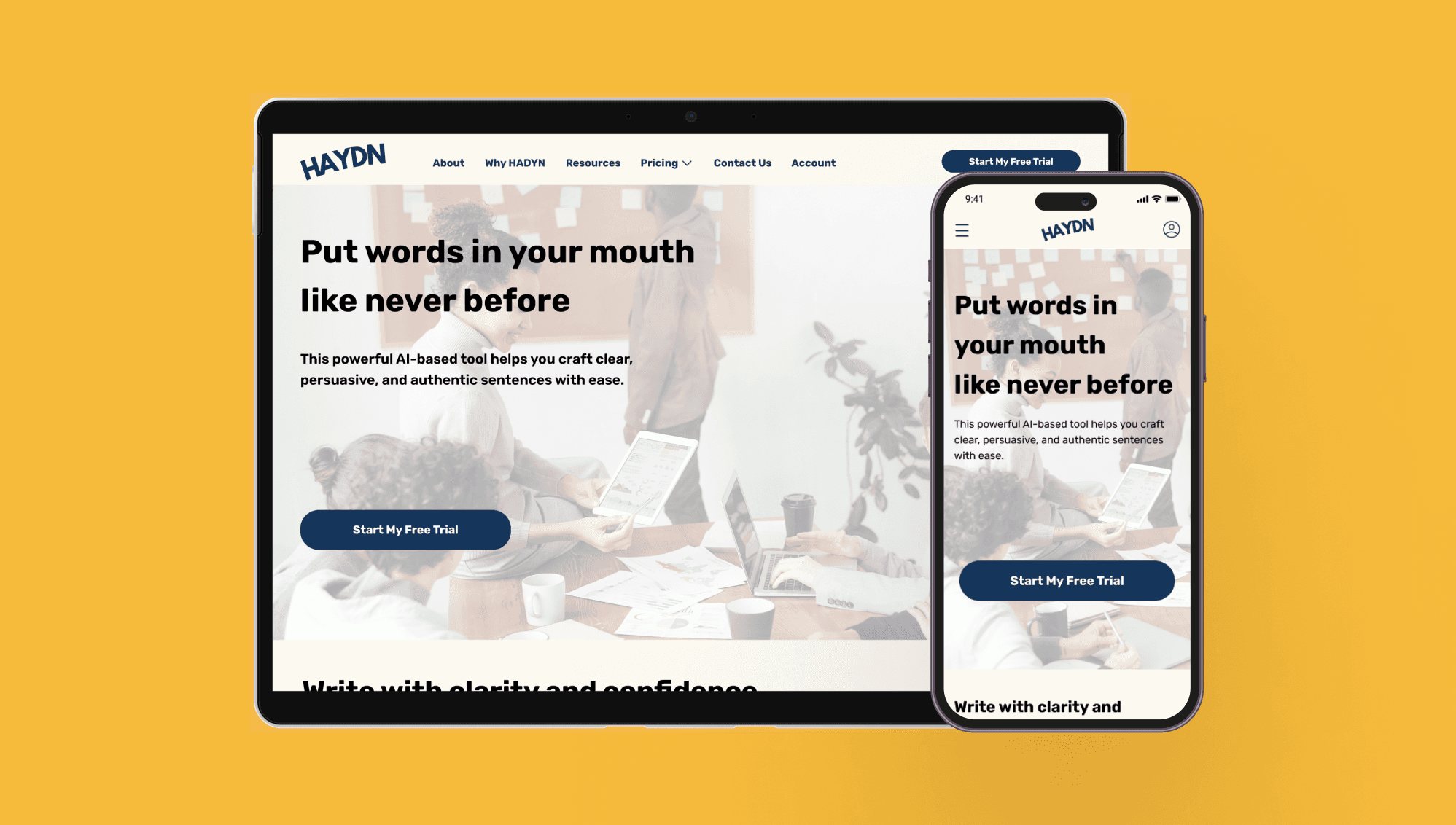
The final designs of the marketing landing page are responsive and create a consistent experience across devices. As the user moves from mobile to tablet to desktop, more visual information is provided in the form of imagery. The text, however, remains the same throughout each view because this information would need to remain accessible on any device to help market the product.
Per my competitive analysis, I repeated the primary CTA throughout the marketing landing page in order to prompt the user several times to try HAYDN AI. To honor the client's wish to use real life people in their marketing information, humans are at the center of this page design. From the hero image to the video carousel, users can see real people engaging with and recommending HAYDN AI.

Also integral to this design were the mircointeractions and animations that I incorporated:
A hover state for the main CTA
A automatic animated logo carousel for brands that currently use HAYDN AI
A video review carousel
Given that the primary goal of this page was to get users to sign up for HAYDN AI, I used microinteractions to keep the page active rather than static and encourage users to engage with the site. Furthermore, this was an exciting opportunity for me to explore and further develop my animation and microinteraction skills.
Finalizing The Mobile App Interface:
My final design of the mobile app honored HAYDN AI’s brand, staying consistent with the style guide.
The initial animation of a welcome message to the user evokes the sense of a personal assistant, which is what HAYDN seeks to be. The use of color maintains a sense of calm. The various screens and microinteractions create a dynamic and seamless experience.


Prototype
Final Mobile App Design:
Final Mobile Marketing Landing Page:
Final Tablet Marketing Landing Page:
Final Desktop Marketing Landing Page:
Takeaways
Reflections:
This project was an excellent opportunity for me to improve upon my design skills and meet client expectations. I particularly appreciated the chance to sharpen my microinteraction and animation skills. I had to ask myself what purpose these microinteractions served and how they benefited the user and the client. This pushed me to create impactful microinteractions.
Because I inherited a style guide and pre-established assets, I learned to work within constraints. My job was to learn about user mental models to build validated information architecture and apply these insights to represent HAYDN AI's brand.
Finally, this project allowed me to continue to center accessibility in my work. To meet this goal, I ensured that color alone did not convey meaning, that all of my color contrasts met the standards of WCAG guidelines, that key information was easily discoverable, and that visual hierarchy helped imply importance of information.
Looking Forward:
If given the chance, I would have loved to conduct more user testing to see how to better design the mobile product and test the efficacy of the marketing landing page design.
