Scholarize
A digital app to help parents personalize
the school search process for their children.
Project At A Glance
The Ask:
As a part of my work with Flatiron School, I completed a project titled “Better School Choice.” The ask of this brief was to conduct research about how parents decide where to send their children to school.
From the insights of that research, I followed a full design process of ideation, testing, and iteration to create a new digital product to address the most pressing pain points that parents face when picking schools:
finding schools that meet a complex balance of wants and needs (which can often compete with each other)
finding the right word-of-mouth references to help them make informed decisions
Timeline:
3 weeks / Dec 2022-Jan 2023
Team:
I formed a research group that made a structured interview research guide and a digital survey to send to target users. We each conducted interviews on our own.
My Contributions:
UX Designer: competitive analysis, user interviews, affinity diagram, empathy map, jobs-to-be-done, MoSCoW method feature prioritization, and problem statement
UI Designer: mid-fi and hi-fi prototypes, usability testing, task scenarios, user flow diagrams
Interaction Designer: microinteractions and animation
Product Designer: stakeholder presentation
The Discovery Phase
Understanding Our Users:
Given the initial brief, I assumed that our target users would be parents who had school-aged children. I knew that I needed to conduct interviews to better understand our users and their specific needs and pain points.
These interviews helped reveal a clearer image of our user type:
Parents open to schools beyond their default local public school (this openness led them to search and use digital resources in the first place)
Parents seeking a centralized resource for finding schools, as opposed to conducting all their own research on Google
Parents who valued word-of-mouth from people they knew when making a decision and sought out references from their circle
Parents who already knew their wants and needs in a potential school (thus they wanted a tool that helped them find schools that met those needs)
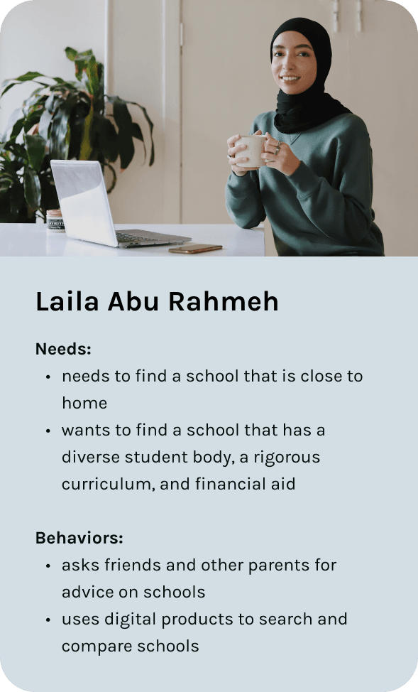
I created the persona and empathy map for Laila, our target user, in order to better empathize with her and solve for her needs and wants.
The Insights:
In order to gain a better understanding of which products already existed for parents looking for schools, I conducted a competitive analysis.
I identified a few key features that were standard across school search websites (and that users might expect in our product):
A search
and
sort feature
School profiles
with a wide
range of data
Map and
list views of
search results
It became clear that users would expect the ability to search and find schools that are evaluated by a variety of criteria (such as grades, diversity, etc.). When looking at each website, however, the logic behind school order on a search results page was not clear. Moreover, many of these websites lacked apps and were only accessible via web browsers. I realized that there was an opportunity to create an app to make this a clearer, more personalized experience.
Structured interviews gave me the most valuable insights into the process and challenges that users faced looking for a school:
“Our top priorities were cost, distance, and best teachers (but we don’t know how to figure that last one out).”
Regardless of how much they cared about academics or extracurriculars or student body makeup, parents emphasized the importance of cost and proximity. Our digital product would need to help parents search while accommodating these crucial (and sometimes limiting) factors.
“We’ll have to trade off proximity for more diversity. We’ll have to figure out how to prioritize and pick based on our values.”
Every user talked about struggling to negotiate their wants and needs in a school. While they had a list of what mattered, they needed to make trade-offs, such as fewer extracurriculars for more diversity. I saw an opportunity to solve for the challenge of making trade-offs to help parents prioritize to find the right fit.
“We preferred to talk with families we knew and adjust based on our opinions of those people, rather than random online reviews.”
Users highly valued word-of-mouth when deciding on a school. Talking with other parents was integral to the school search for parents. While most of these conversations happen organically in person, I identified the need for a product to take this into account as a part of the school search process.
Crafting Our Problem Statement:
After analyzing and synthesizing my research (through steps like affinity diagramming, empathy maps, and jobs to be done), I crafted a problem statement to help focus my ideation and problem-solving around the user experience:
Parents looking to enroll their student in school need a digital product that will help them find, evaluate, and validate schools based on their personal criteria and trusted sources because the school search process is a constant give-and-take of values and word-of-mouth helps parents feel confident making a choice.
Finding The Solution
Ideating Around Features:
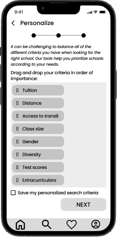
When I first started sketching possible solutions, my mind circled around the image of an audio mixing console: by increasing or decreasing the levels of various audio inputs, a user can create a unique audio output. Knowing that parents described the school search as a deeply personal give-and-take of values and needs, I wondered how I might take inspiration from this idea and help users generate personalized lists by playing with the “volume levels” of different school criteria.
I also knew that I wanted to incorporate the importance of word-of-mouth in my design because each of the interviewees highlighted the importance of others' opinions. As I sketched possible solutions, I struggled to address this pain point. It felt like I was solving for two different problems at once. Thus, I focused on the give-and-take aspect of the problem statement and landed on a feature that could eventually incorporate word-of-mouth.
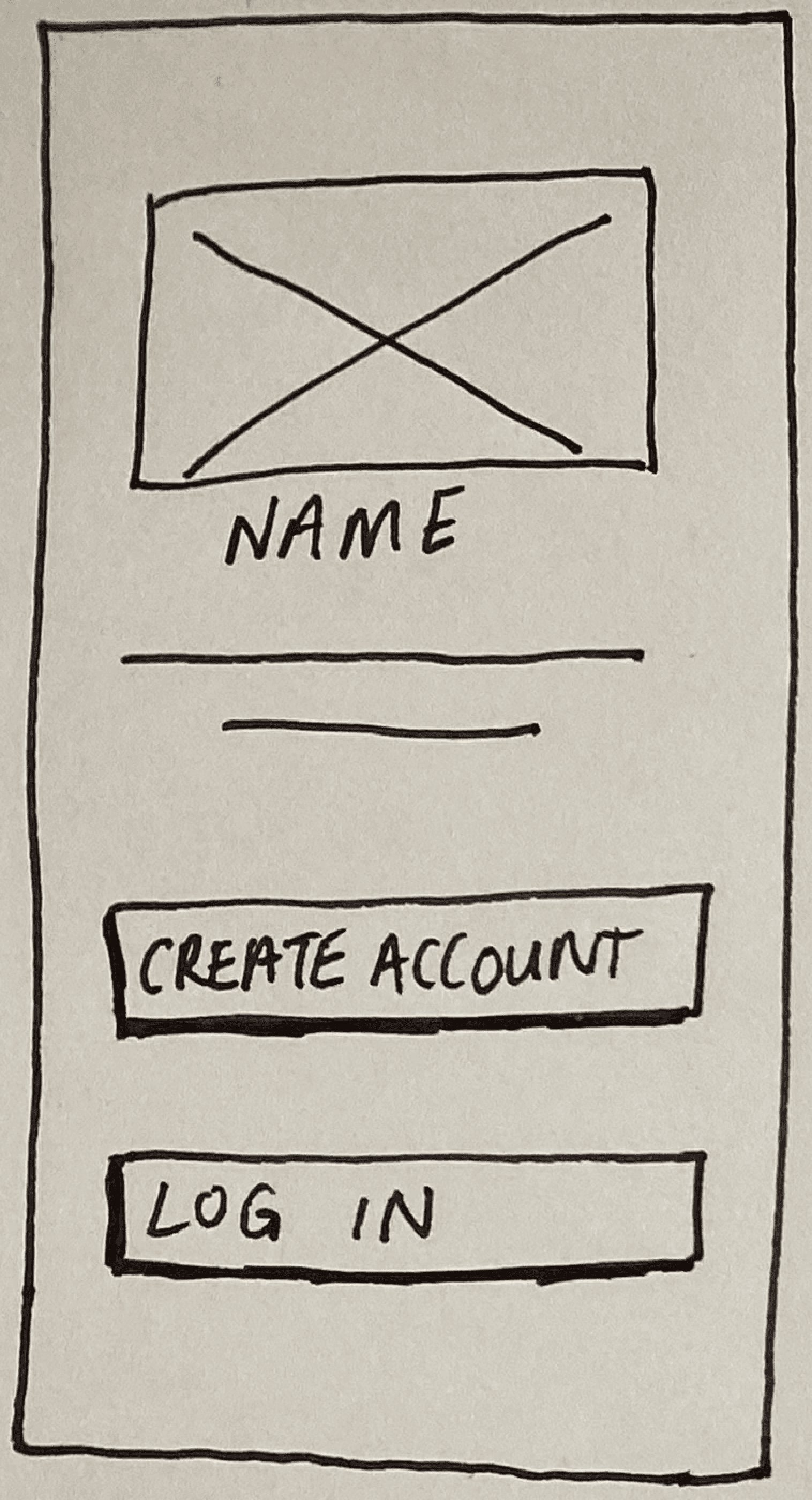
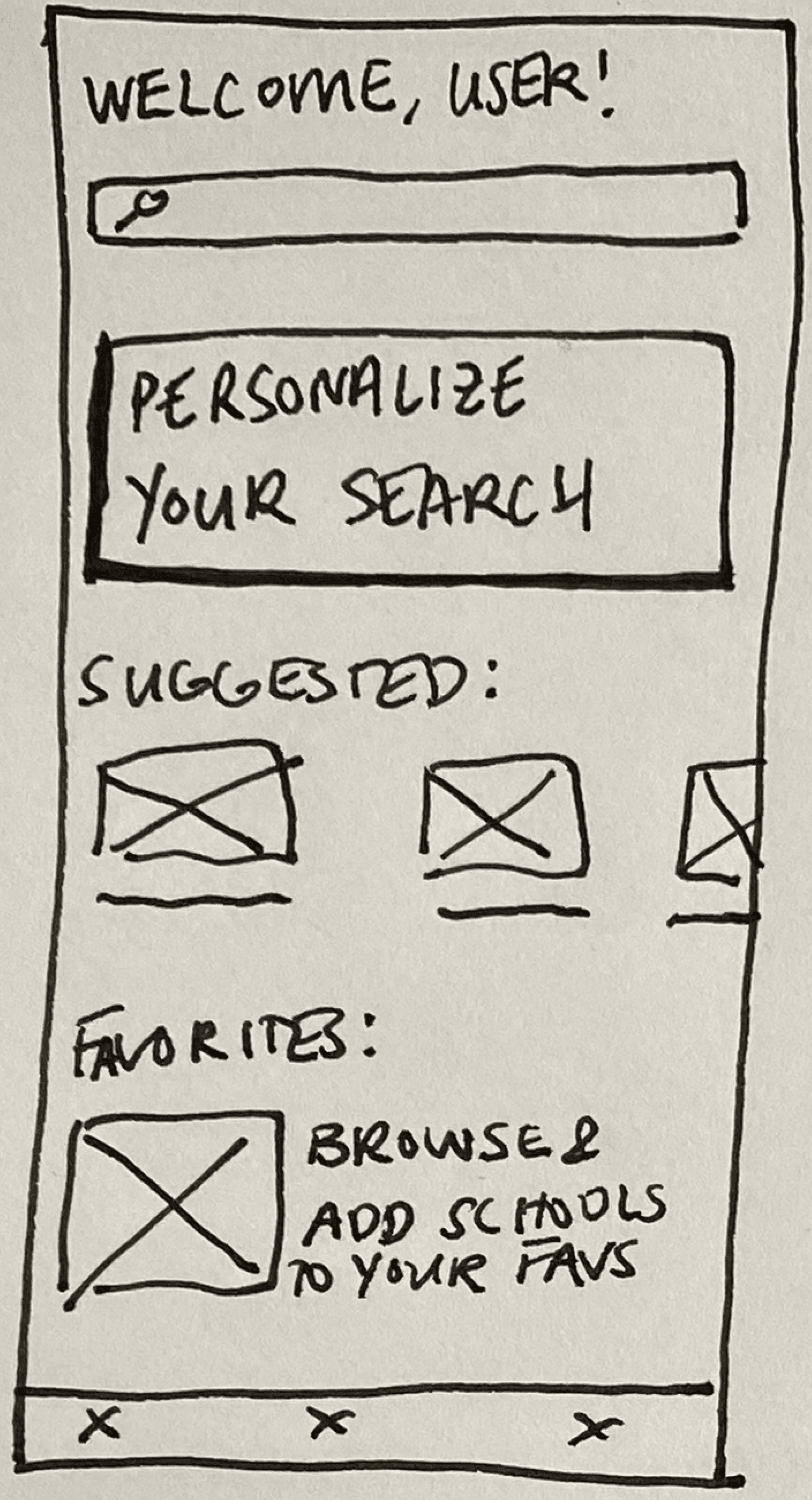
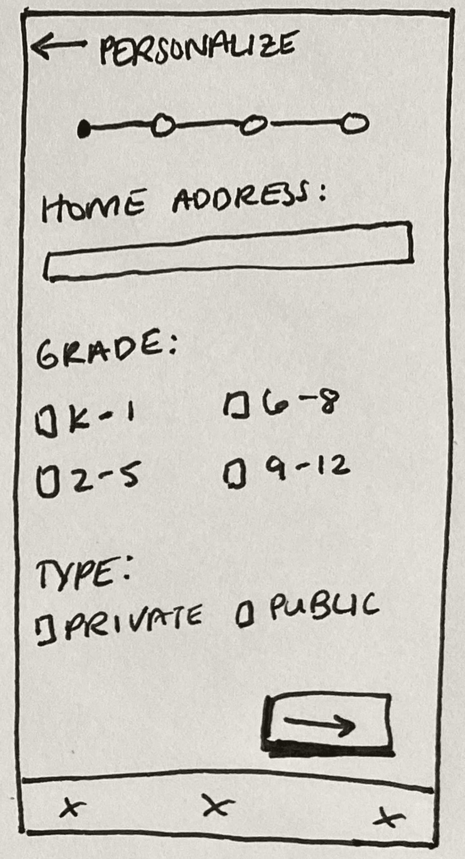
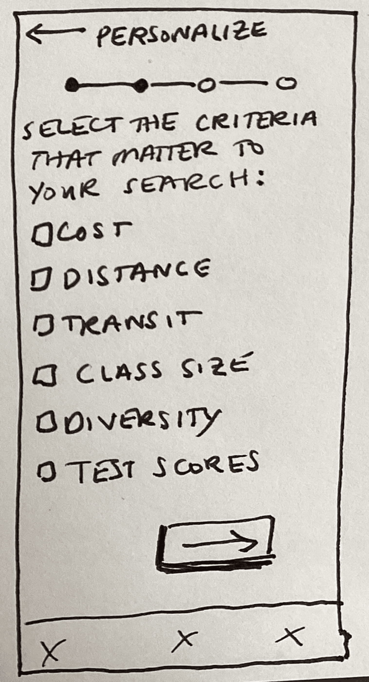
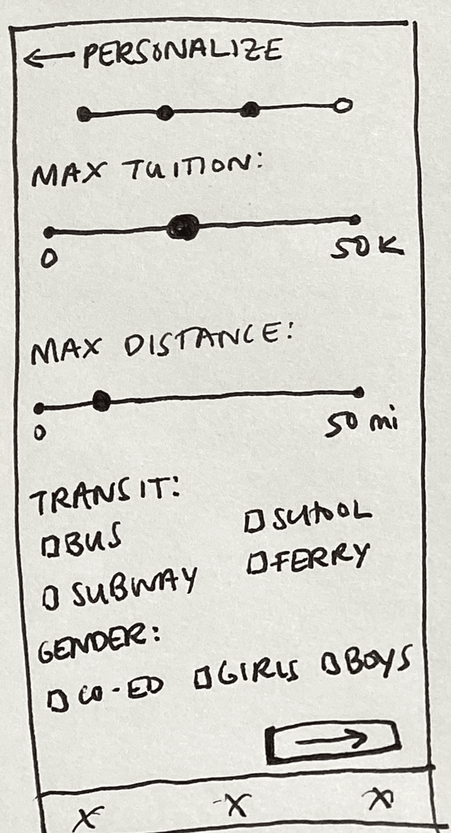
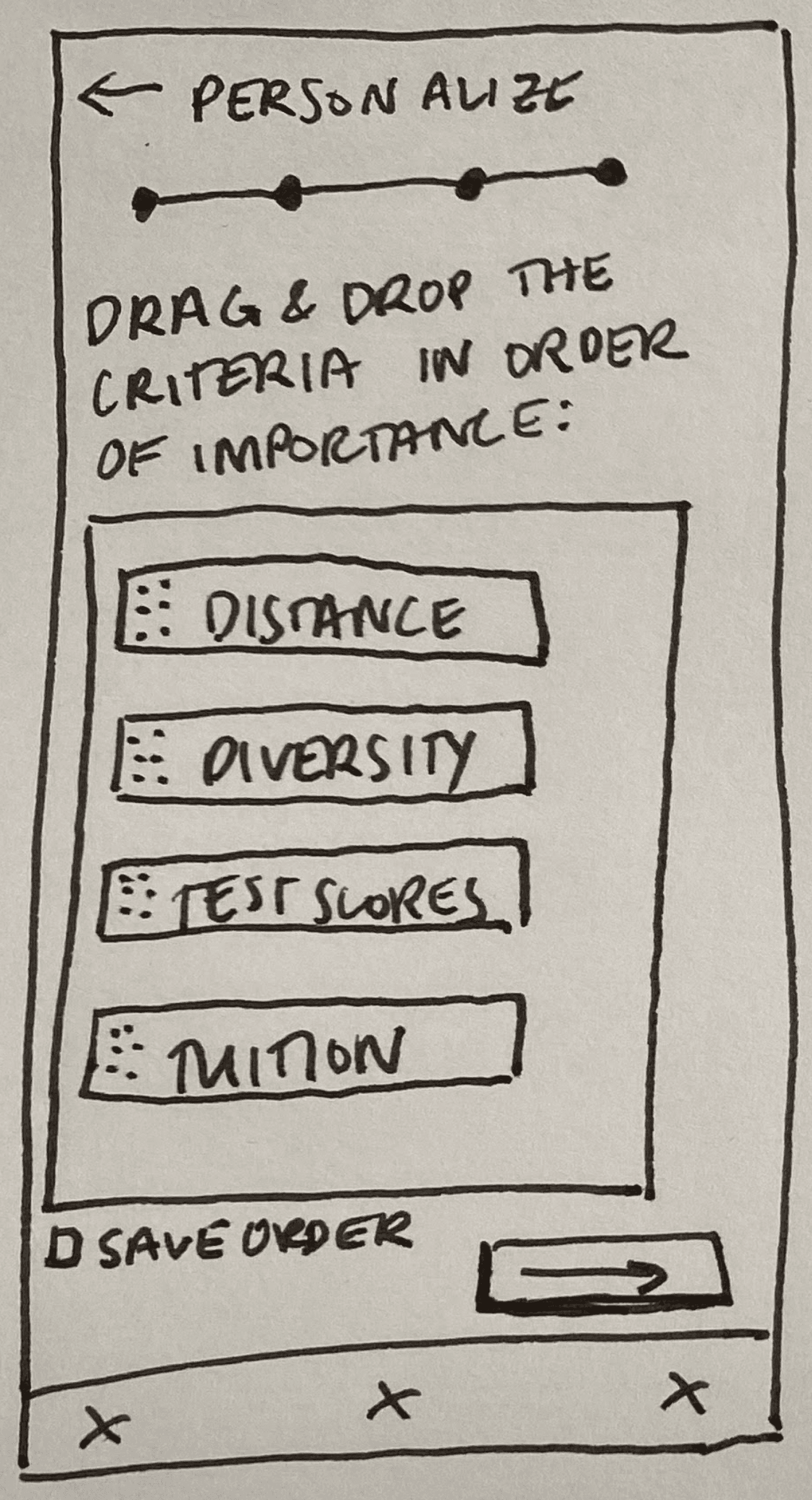
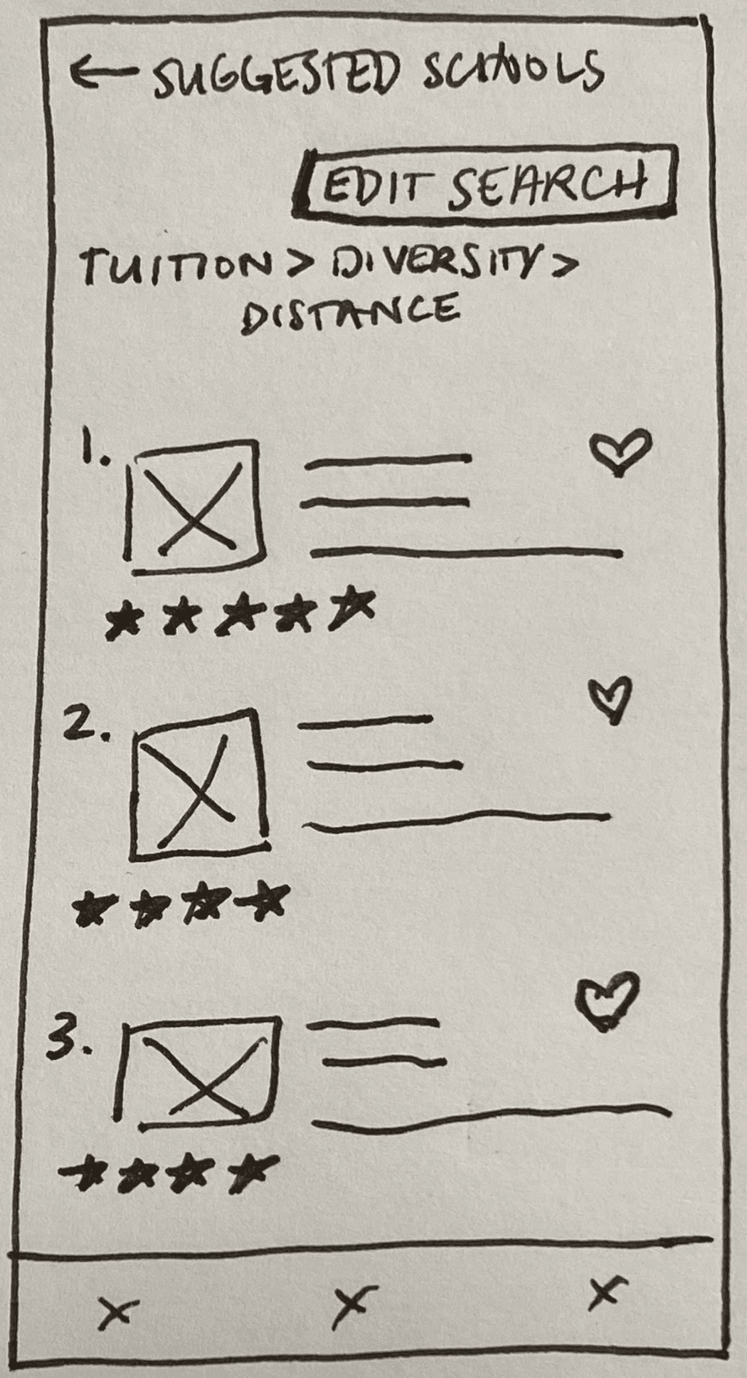
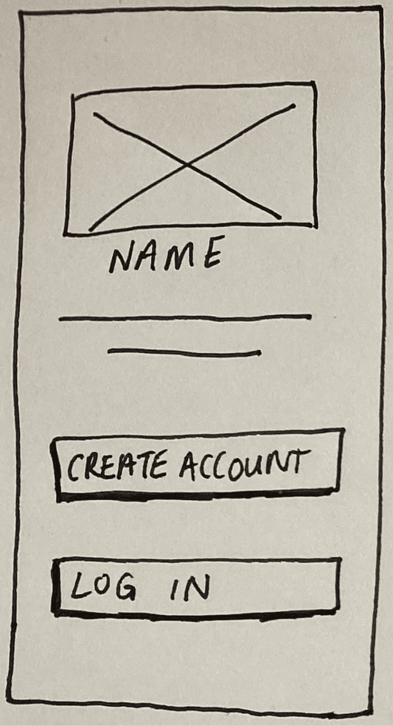
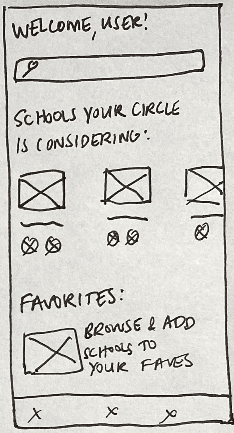
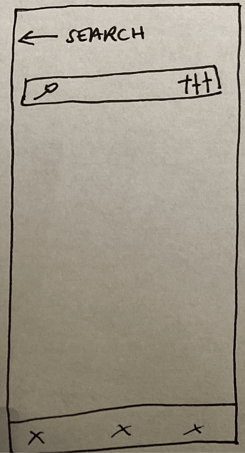
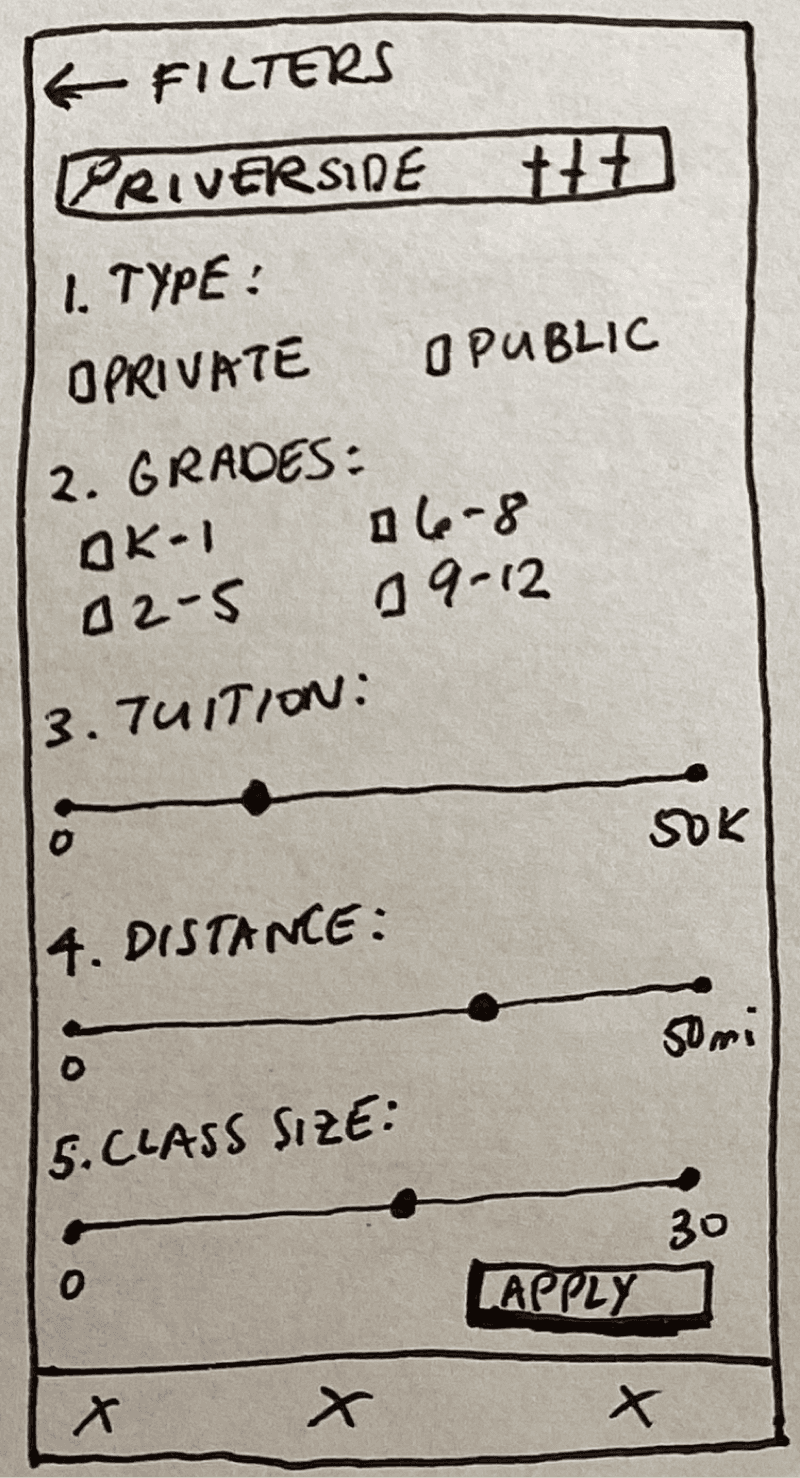
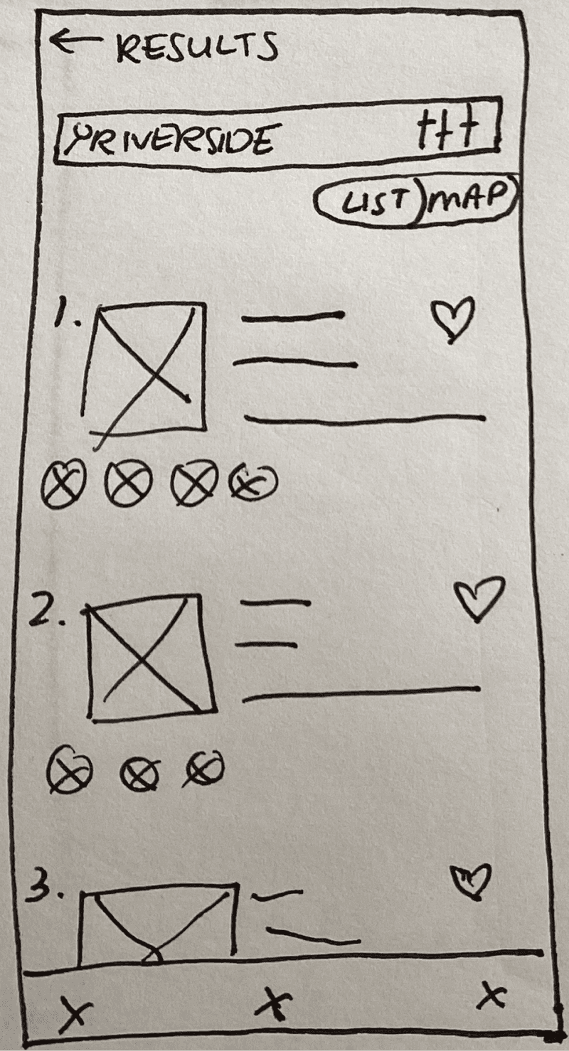
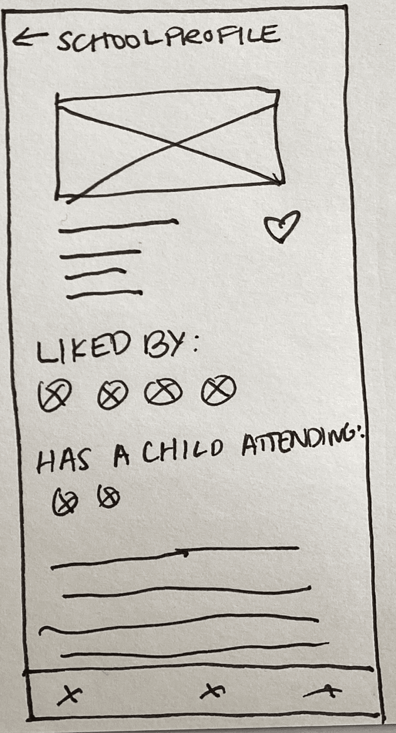
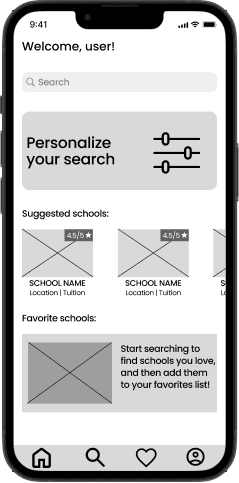
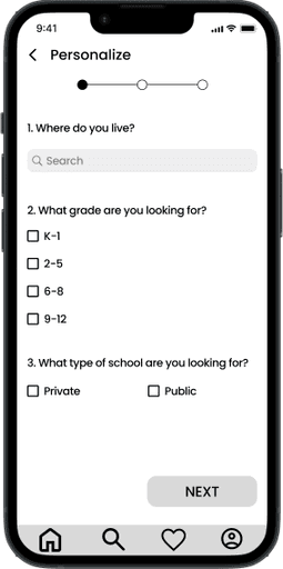
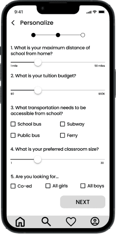
I decided to build a feature that allowed users to personalize a school search based on their limiting factors and prioritized criteria. I opted to use a standard search pattern and enhance it because I wanted to take a feature users would be familiar with and better tailor it to their unique needs. Following my creation of a task flow diagram, I transformed my low-fidelity wireframes into mid-fidelity wireframes for usability testing.
Testing Features:
With my mid-fidelity wireframes, I conducted usability testing with 4 different target users. I wanted to know the following information:
Did my task flow let users prioritize school search according to their needs?
Were there any pain points in the design of my wireframes, be it in wording or interaction design?
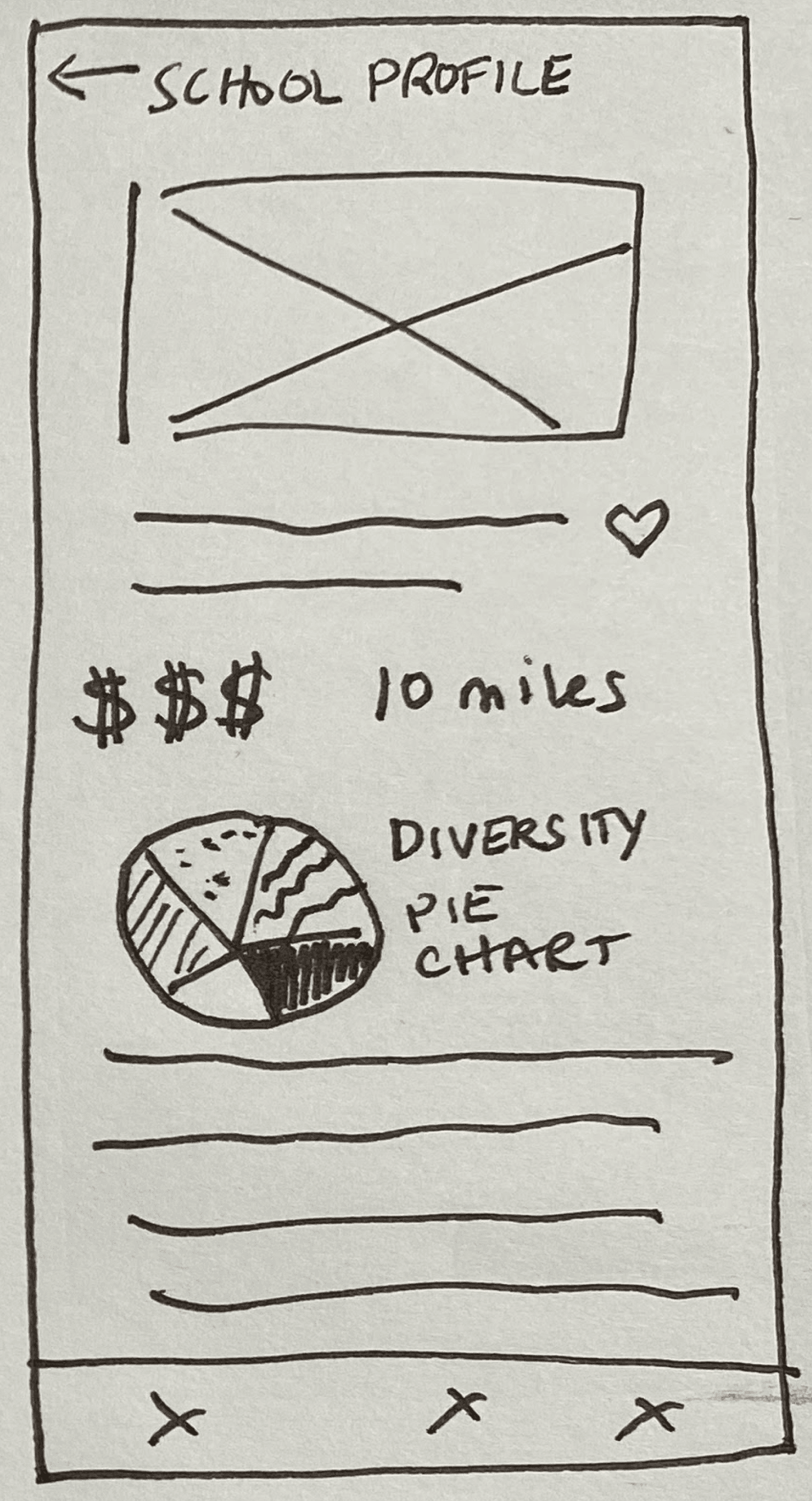
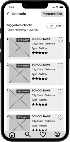
What information did users anticipate and want in a school search results’ page and school profile?
I asked users to run a personalized school search to find a private 9-12 school that was no more than 20 miles from home. They had to favorite a school that was well-rated in terms of diversity and extracurriculars, with diversity being a top priority.
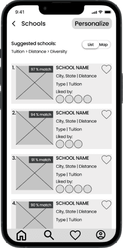
Following this usability testing where users thought aloud, I showed users different variations on the search results screen. I wanted to understand if there was an opportunity to add a word-of-mouth feature into this task flow and if users would prefer this feature over a general rating of the school.
VS

2

3

4

Iteration After Testing:
With my usability testing insights, I then iterated on my mid-fidelity wireframes, building a word-of-mouth element into the design and trying to clarify the ranking feature. Clearer UX writing was necessary here so that users understood how this feature would benefit them and influence their search results.
Creating The Final Designs
Building Scholarize's Brand:
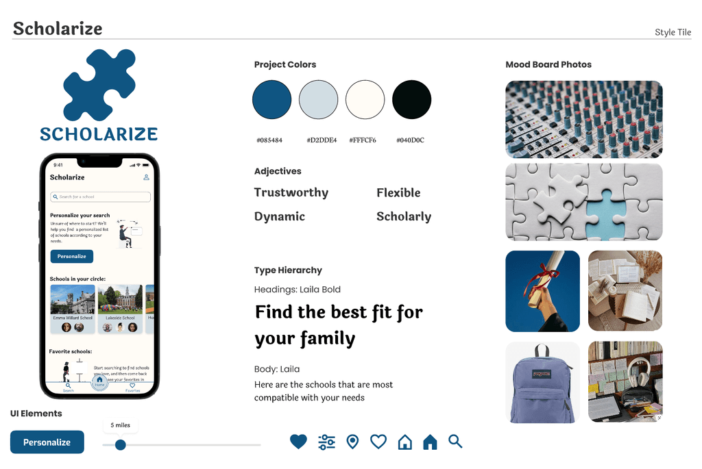
The next step was to design a brand identity and style tile to represent our digital product. When thinking about how users would feel about this product, I landed on the following adjectives:
Trustworthy
It was important that users feel they could trust the search process and depend on it to give reliable and informed results
Dynamic
Thinking back to the sound mixer, I wanted to create a dynamic app that was responsive to user needs
Flexible
A flexible brand would be one that was accessible to a variety of users and could mold itself to match their needs
Scholarly
Given that this app is for finding a school, it was crucial to have the app feel academic to the user
Given these qualities, I created the name Scholarize to evoke the scholarly and dynamic nature of the product. I then used mood boarding to build a visual representation of Scholarize and a color palette that drew upon color psychology: blue for trustworthiness and calmness, and cream for simplicity.
Each user spoke of trying to find their perfect fit in a school. The puzzle piece logo represents finding where your child belongs - a comfortable, not forced fit. It is playful and simple.
Personalizing The Search For The Give-And-Take:
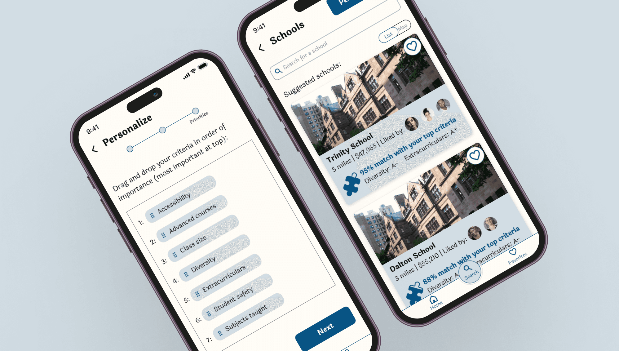
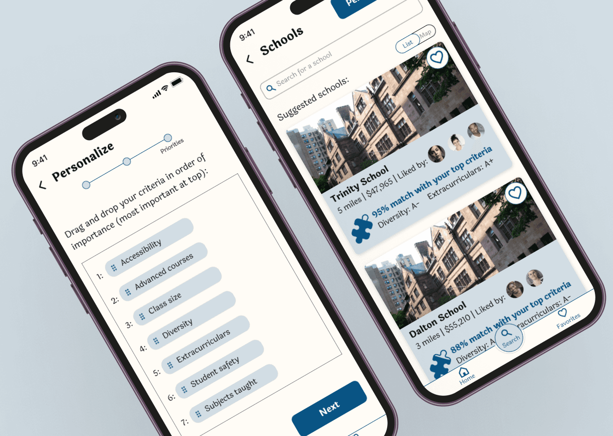
Following testing , I refined the ranking feature to address the pain point of trading off values to find a school that meets prioritized needs. In asking for dealbreakers, the feature allows users to set the boundaries of their search by some of the most important factors identified in user research.
An overlay pops up to explain why this feature exists and how it will help users, lessening cognitive load.

This interactive drag & drop feature is the way the user “mixes” their own search results. In increasing the importance of certain criteria, different schools rise to the top of their results list. These criteria are evaluated based on the school data that Scholarize has access to; the app gives each school a rating based on this data, highlighting the strengths of each school.

On the results page, the logo puzzle piece partially filled indicates how compatible a school is with the user’s search. That, paired with the Scholarize grade for the user’s top two ranked criteria, creates a sense of transparency regarding the order and options of the search results. It is clear why a school is being shown to the user and how strongly it meets their different needs.
This information is also highlighted on the school profile page, with greater visual hierarchy than the lower ranked criteria that show up later on the school profile.
Creating A Feature For Word-Of-Mouth:
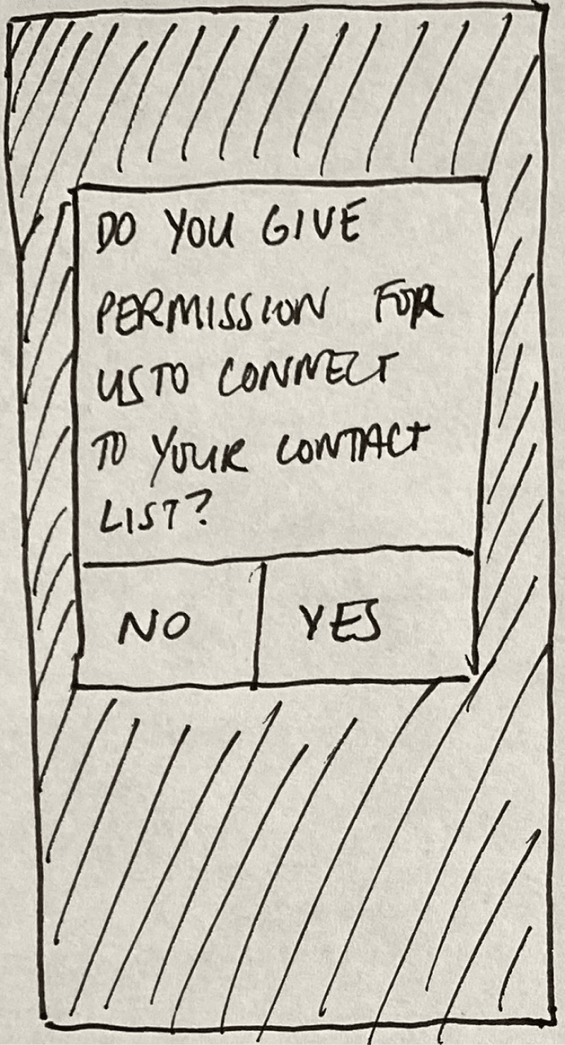
Although it was at first difficult to design for word-of-mouth, I took inspiration from products like Spotify. Thinking of how Spotify shows the music a user's friends listen to, I designed a feature that would let a user see who in their contact list had liked a school.
This digital product would not replace the in-person conversations, but it would help users improve their pursuit of word-of-mouth by showing them people to speak with. When presented with this new feature, users validated it and liked the transparency of seeing who else in their circle was considering certain schools.
Prototype
Final Product Prototype:
Takeaways
Reflections:
There was a lot to learn from this project. I particularly enjoyed the way in which this project pushed me to prioritize user-centered design. It was only through speaking with real users that I was able to identify a key pain point that they faced. Although I had initial ideas and assumptions when I first read the project brief, I knew it was crucial to get users in the room. Each time I met with users, my designs became more precise and tailored to their needs.
I also delighted in the creativity of problem-solving. Once I had a problem statement, I diverged far and wide to sketch different ways to solve that problem. In thinking beyond the scope of direct competitors, I drew upon products that I have seen and used in the real world and took inspiration from them. The true highlight was then seeing users validate the helpfulness of this solution through testing and interviews.
Looking Forward:
Given the time frame of this project, there are areas in which I would love to continue to develop it. This case study demonstrates the minimal viable product, and I would love to further iterate upon the school criteria prioritization feature.If I were to continue to take this project forward, I would conduct more user testing to see if the rank feature is clear to users and meets their needs when it comes to weighing different values out in a school.
I would also collaborate with software engineers and data scientists to determine the process by which grades are assigned to the criteria of the app and the algorithm for matching schools to the personalized search.That said, I believe that the most necessary features and functions in my final designs solve for the problems users face. It is for that reason that I think this project was a success.
